Class Booking Feature for Gym Members

A User-Centered 🎯Approach
This project focused on designing an intuitive class booking feature for the Gym app, prioritizing member needs to boost participation and support the franchise’s goals. Using user research, competitor analysis, and iterative design, I created a solution that enhances the gym experience.

Role and Responsibilities

UX Designer
I led the design process, assisted with UX research, and collaborated with stakeholders to create a user-centered class booking flow. This included conducting usability testing 🔍, iterating prototypes 🔄, and delivering a polished final design 🎨. My role extended to problem-solving based on user feedback 🤔 and ensuring the solution aligned with the gym’s business objectives 🎯.
Tools
🤔 Problem
Gym members needed a quick and effortless way to book classes while managing class details and requirements. The existing workflow lacked clarity and efficiency, leading to user frustration and drop-offs in the booking process.
🎉 Outcome
The redesigned booking flow streamlined the process by emphasizing key class details, improving error messages, and introducing features like “quick book” and waitlist management, creating a smoother, more intuitive experience for gym members.

Research and Discovery

Understanding 🧠 User Needs
Through generative research interviews, I gathered insights into what gym members consider most important when booking classes. Key questions included:
  • What information do you need to decide on a class?
  • What challenges do you face when booking classes?
Enhanced Class Card Design 🗂

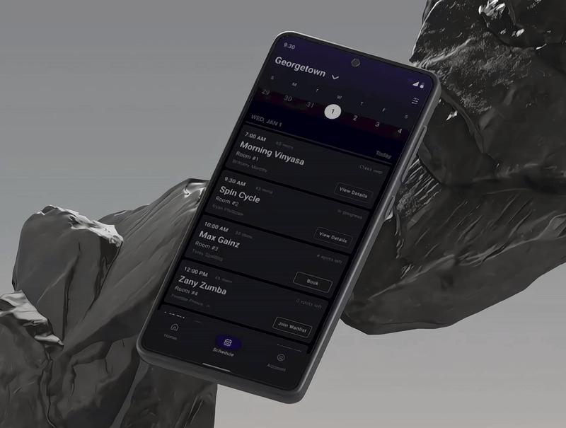
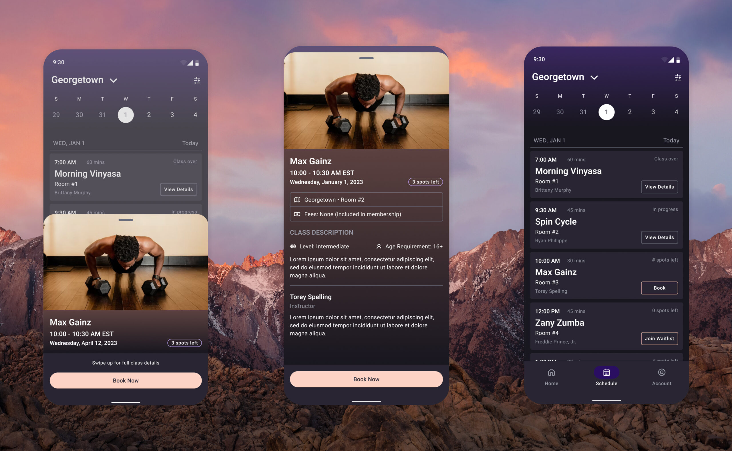
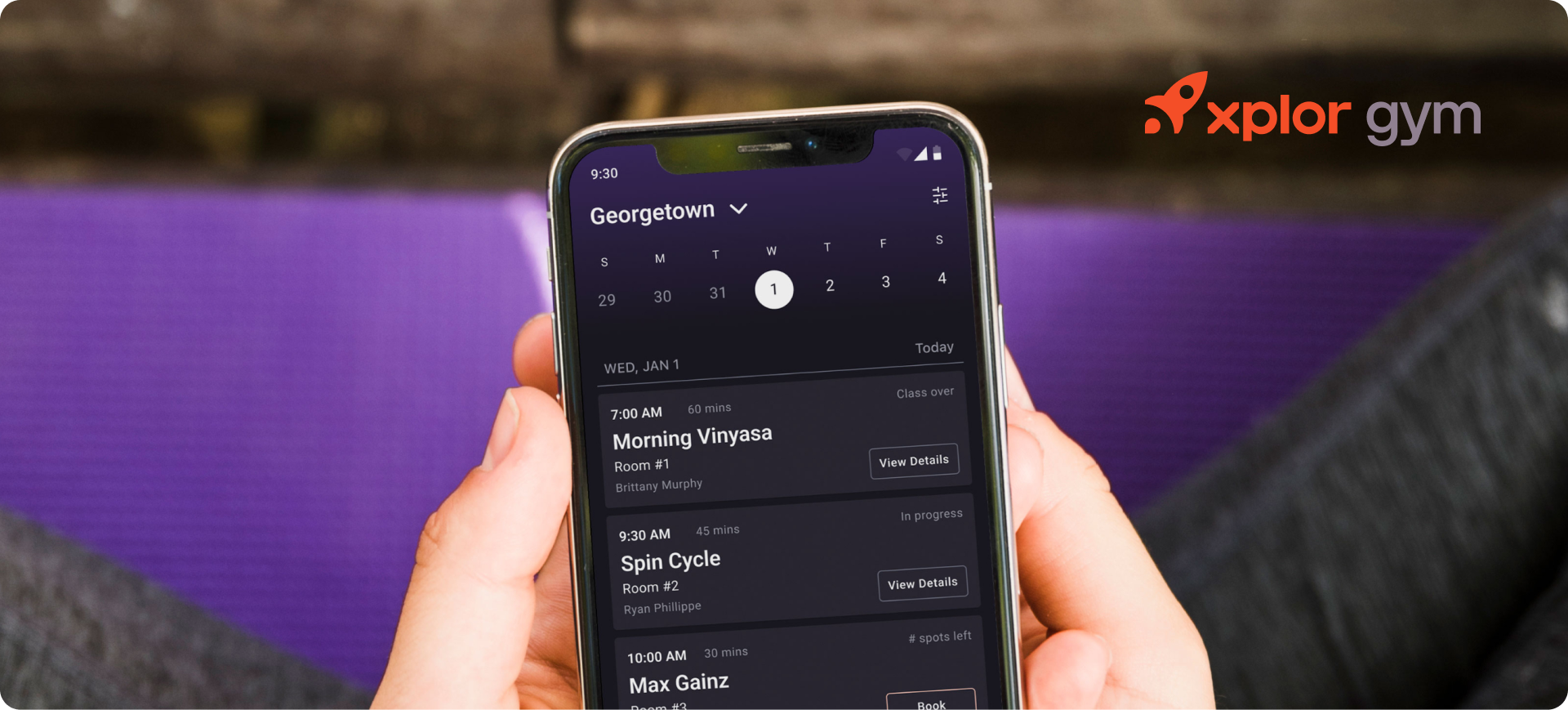
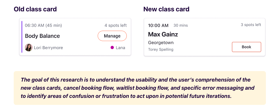
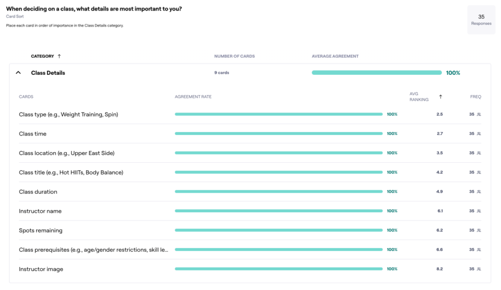
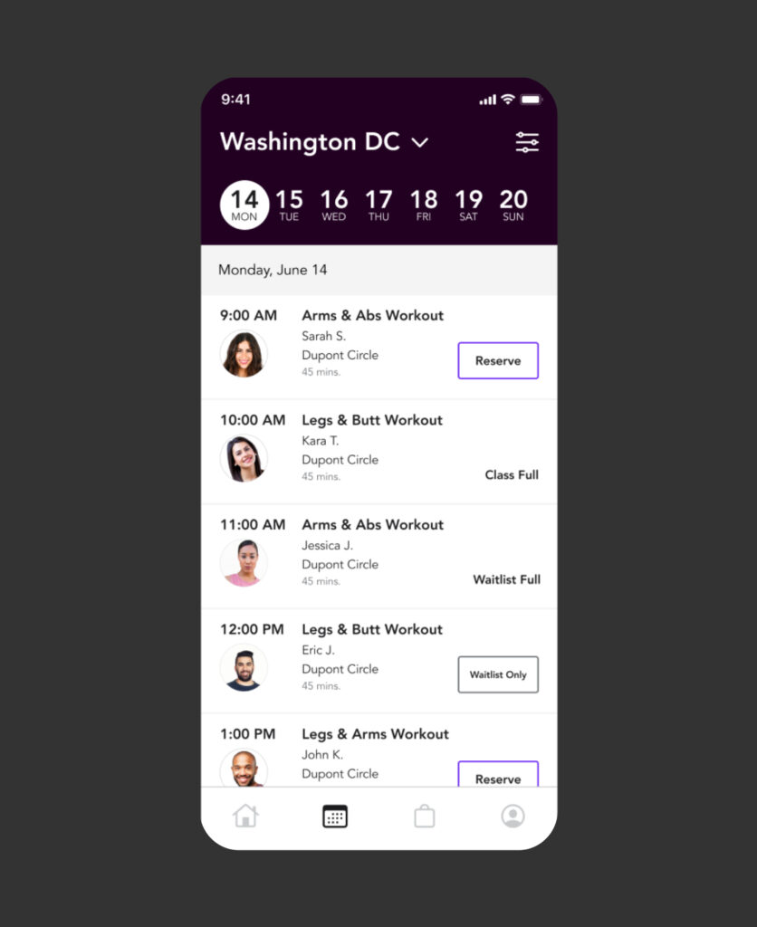
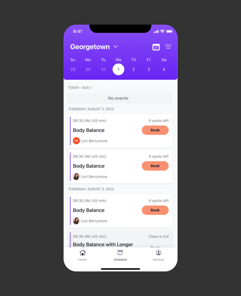
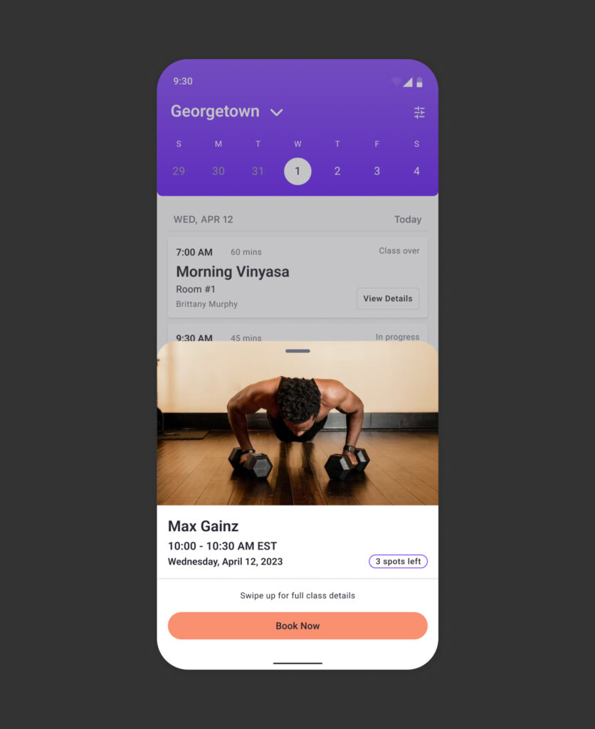
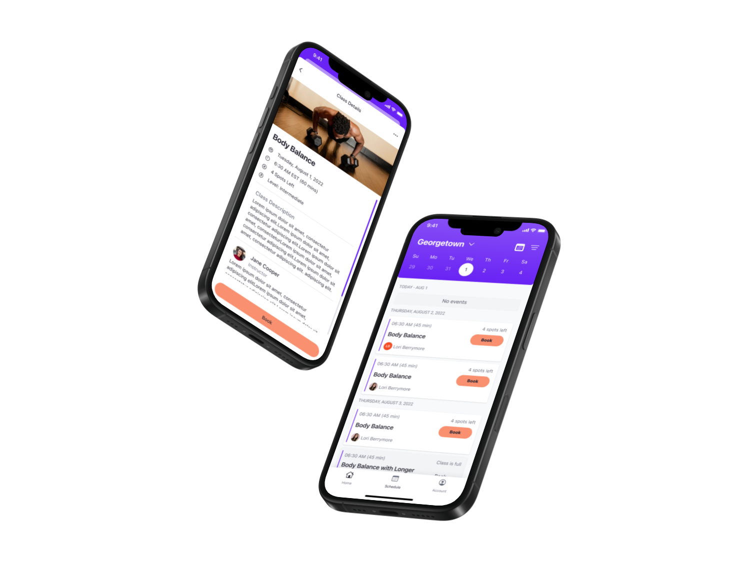
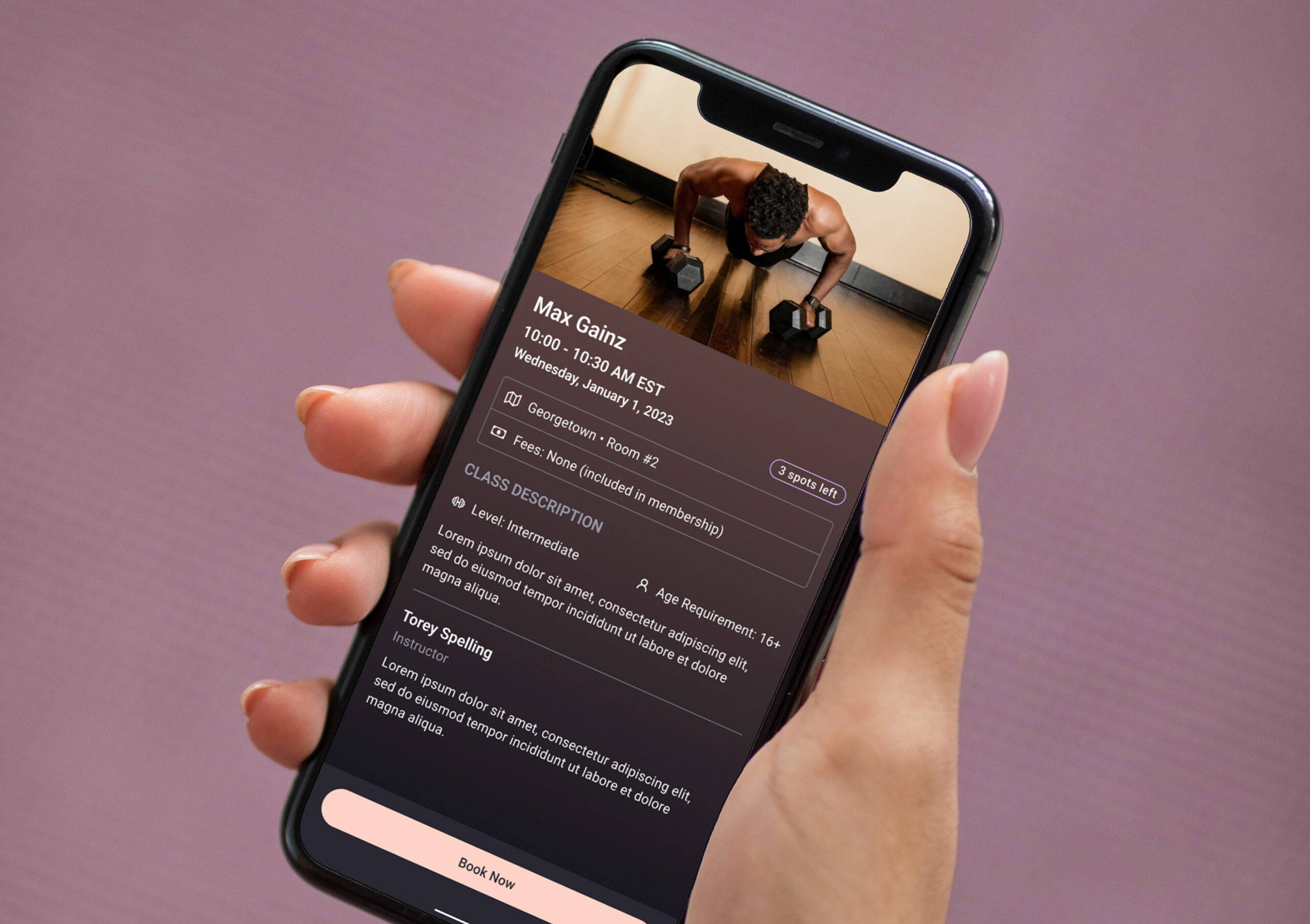
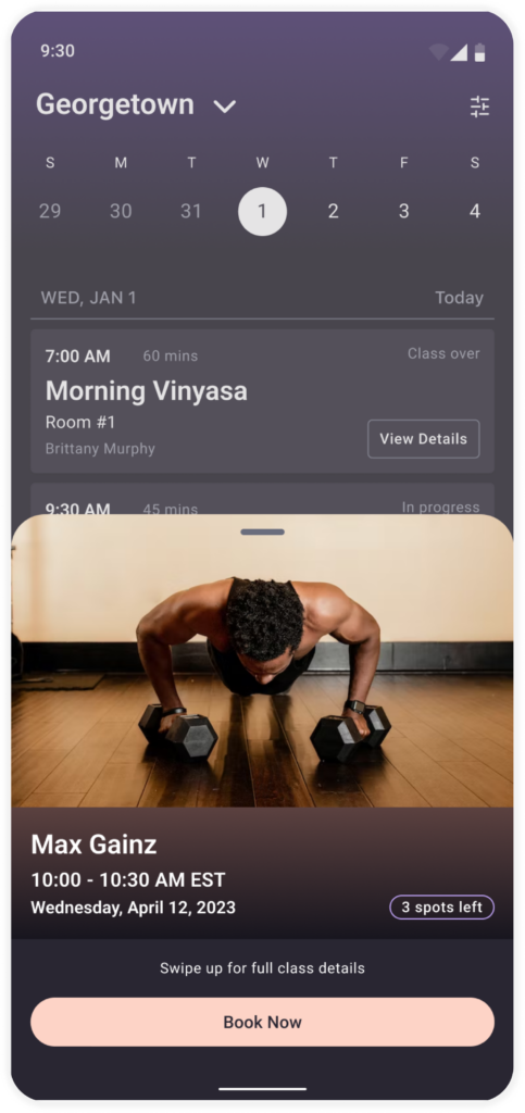
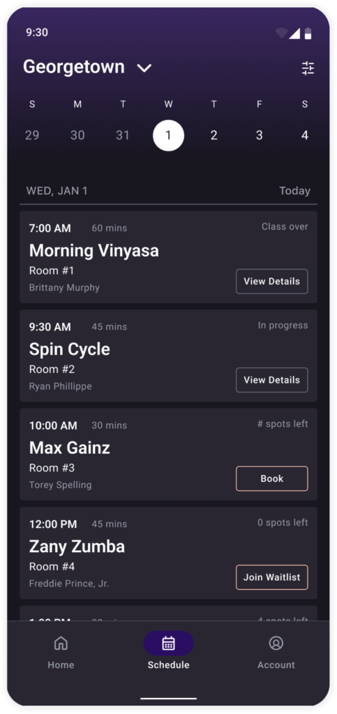
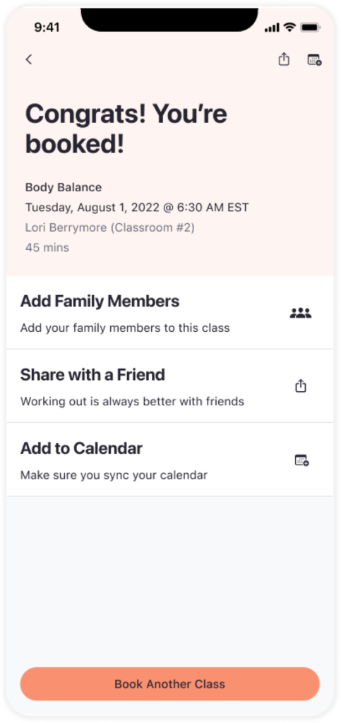
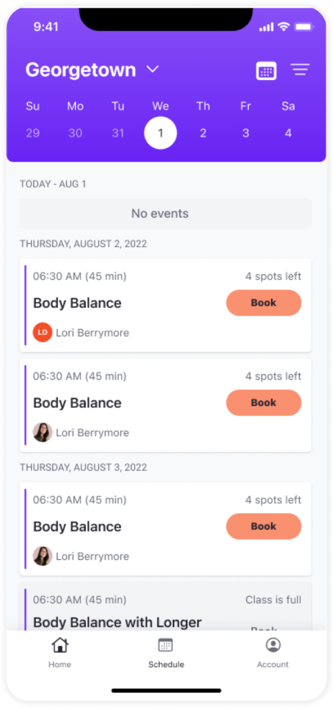
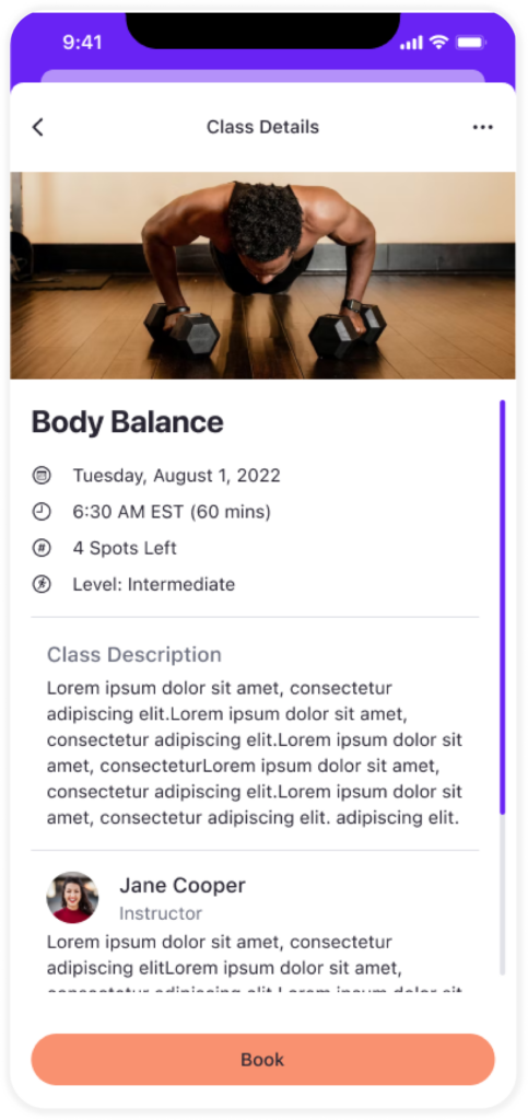
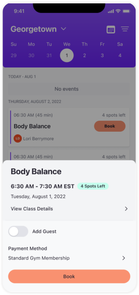
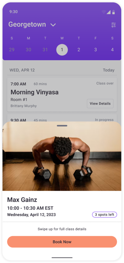
Prominent display of class name, time, and key details for quick decision-making.

Error Messaging Improvements ⚠️

Clear and actionable error messages to reduce confusion.

Quick Book ⏩ Option

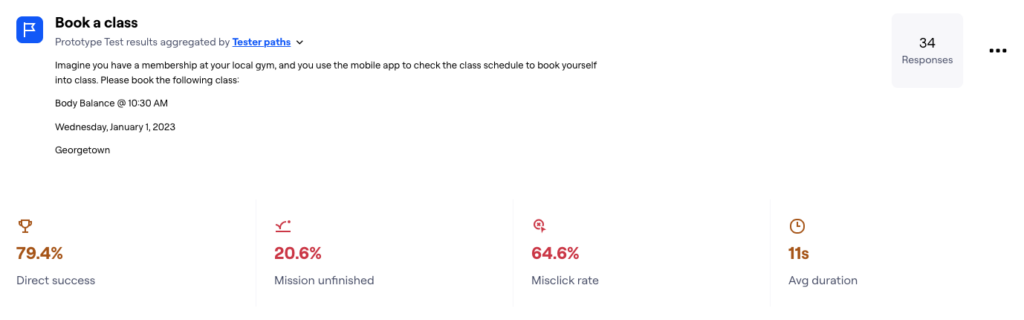
Designed for experienced members to expedite the booking process.

Waitlist 📋 Management

Streamlined joining and cancelling waitlists to give users more control over their reservations.

BEFORE
AFTER
BEFORE
AFTER

Delivering a User-Centered Solution

Final 🏁 Design
The final design emphasized visual hierarchy, reducing distractions and guiding users through the booking process. Screenshots of the class schedule and booking screens illustrate how the new design enhances usability and satisfaction.

Reflection and Takeaways

📚 What I Learned
This project emphasized the value of user research in understanding pain points and guiding design decisions. Iterative testing played a critical role in refining the workflow to meet user needs. Moving forward, I plan to expand the feature to include additional enhancements, such as personalized class recommendations based on member preferences.
Close

Lorem Ipsum Gravida Nibh Vel Velit Auctor Aliquet. Aenean Sollicitudin, Lorem Quis Bibendum.

Address
Follow us
Skip to content